Jumat, 22 April 2011

Paris Opera by Charles Garnier

France not only famous with The Eiffel Tower but France especially Paris full of wonderful architectural building. One of them is The Paris Opera, also known as Palais Garnier, is the most famous auditorium in the world. This auditorium has 2,200 seats capacity and designed by Charles Garnier is admired as one of the most prominent architectural masterpieces of its time. As a part of the great Parisian reconstruction, the Paris Opera was designed. This project was initiated by Emperor Napolean III of the Second Empire. Baron Haussmann was chosen directly by the emperor as the supervisor for this project and he started to prepare 12,000 square meters of land to built Paris Opera. This would be the second theater for the world renowned Parisian Opera and Ballet companies. An open competition was announced in 1861, which was won by Charles Garnier who was an unknown 32-year-old architect at the time.
Palais Garnier is of the Neo-Baroque style, a term used to describe architecture that encompasses the key characteristics of Baroque style although built after the proper time period. The monumental style can also be classified as Beaux-Arts, with its use of axial symmetry in plan, and its exterior ornamentation. One of the major urban implications of the Paris Opera is it’s location at the northern end of Avenue de l’Opera in France. It’s role as the terminal axial point suggests that as a public space, it should hold much importance in the community.

The audience sits centered around a hanging chandelier, weighing over six tons, and the large stage was built to accommodate up to 450 artists. It is opulently decorated with marble friezes, columns, and statuary, many of which are used to portray deities from Greek mythology. The Paris Opera was meant to be a social gathering space for the people, which is reflected in the interweaving corridors, stairwells, landings and alcoves which allow movement of large masses of people while also permitting socializing during intermission.

Palais Garnier became an influential architectural prototype for many theaters built around the world.

Source : Archdaily

Sabtu, 02 April 2011

Songdo International Business District by Kohn Pederson Fox

Located on 1,500 acres of reclaimed land on the West Coast of Incheon, Korea, Songdo International Business District become important business center in Korea. Designed by famous architects, Kohn Pederson Fox, Songdo International Business District will be very friendly for pedestrian due to the availability of walkable streets and an urban density that allows for an active street life.This district features the New Songdo City First World Towers, Northeast Asia Trade Tower, the 100-arce Songdo Central Park, and the Songdo City International School.

New Songdo City First World Towers is purposed for residential development. This tower consist of 2,545 units of apartment and projected to accommodate 65,000 residents. This tower also features live/work spaces, health club, day care center and senior's center.

Northeast Asia Trade Tower designed to be a skyline landmark of Songdo International Business District. This tower is a mixed-use development that combines office, hotel, and service apartment components, each with its own entrance lobby. The 1,010-foot-tall (308-meter-tall) tower offers views of the Yellow Sea, the city of Incheon, and the surrounding mountains.


Songdo Central Park serves to connect to various civic and cultural destinations and the waterfront via a series of man-made seawater canals accessed by water taxi. The combination of these natural and man-made elements makes this park the cultural and recreational heart of Songdo IBD. Within the park, a series of pedestrian bridges have been designed over the canal system, serving as focal points within the landscape and making for unique destination points.

Songdo International School can accommodate more than 2,000 students that facilitates diverse learning ang teaching styles. The design gives a unique material to each school community identity. Layers of stepped sections and sunken gardens separate these areas without creating barriers, invoking the interplay of solid and void that underlies traditional Korean design.

Sabtu, 19 Maret 2011

The New World Shopping Center, Chongqing by Logon Architecture

Logon Architecture, Germany-based architecture firm has shared their project for Chongqing. Chongqing is projected as a new world shopping center. This shopping center also completed by another facilities like luxury residential housing, a highrise tower and a 5-star hotel. This integration will make people easy to do complex activities in one location.

The intersection of the Jialing and Yangtze river is chosen as a location of Chongqing New World Shopping Center. This location is very strategic and just opposite the old CBD area in Chongqing. Despite the considerable incline of 40m, the shopping paradise is spread across 4 terraced levels, encapsulated in a protective glass mold to keep out the pollution and dirt of the city, fully use natural resources available such as wind, light, water and landscape, creating a comfortable shopping atmosphere and providing a multi-function leisure and entertainment space.
The shops are connected to a strip of luxury residential housing as well as a super highrise tower, serving luxury guests with its 5-star hotel. The super highrise will become the landmark of Chongqing new CBD area. The planning and architectural design was well devised based on the business model, upon completion, New World Shopping Center will become the 13th largest leisure, entertainment and shopping center in the world.

Visit Logon Architecture website - here or via

Sabtu, 12 Maret 2011

Tokyo Tower, A Beautiful Tokyo's Landmark

Tokyo Tower (東京 タワー, Tokyo Tower?) is a tower in Shiba Park, Tokyo, Japan. Overall height of 332.6 m and is the world's tallest self-standing steel tower building. Based on aviation safety regulations, the tower is painted with international orange with white color in some places. Lower surrounding buildings, so the Tokyo Tower can be seen from various locations in downtown.

Tokyo Tower is famous as a symbol of Tokyo's and a tourist attraction rather than its function as an analog TV transmitter tower antenna (UHF / VHF), digital local TV and FM radio. In addition, the railway company East Japan Railway use this tower to put the radio antenna for train emergency systems, and a number of measuring instruments installed by the Tokyo Metropolitan Office Environment.

 
Tokyo tower is quite wonderful when enjoyed in the night time. It can change its decoration from gold light into blue and white light automatically. This tower is designed with anti-earthquake technology. We know that Japan has high earthquake frequency, so this technology is very important for tall building in Japan. Now Tokyo has the next Tokyo Tower project which has double height from previous tower.

Sabtu, 19 Februari 2011

Newport Station by Grimshaw

Grimshaw has redesigned Newport Station in Newport, Wales, England. This project is a part of a citywide regeneration master plan by Newport Unlimited. This station is quite important for transportation between England and Cardiff due to Newport is the first city reached by passengers. This project aimed to provide striking civic building that would provide a gateway opportunity not only to Newport, but to Wales herself.


This new station split Newport with its the railway tracks. As a result, each half of the city has developed its own character. Grimshaw as the architects design embraces this divide, creating two major new concourses. The North Concourse will be on the civic side of the city and focus on the needs of commuters. The South Concourse, on the commercial side, will be for connecting travelers, day trippers and tourists. Each terminal’s function is reflected in the distribution of ancillary facilities around the station.
Ticket facilities and platform access are split equally between the two terminals. All the main facilities at both terminals are housed in continuous ETFE and aluminium clad spirals. The spiral form of the station mirrors the journey taken within and helps to ease traffic flow by guiding the passenger from ground level up to the connecting bridge and back down onto the platforms. The use of an ETFE wrap over a steel structure not only creates a very bright and airy space but also, due to the lightness of the material, means the building requires a minimal support structure. This brightness of space is compounded by the inclusion of an oculus at the peak of each building, which doubles as a compression ring to secure the structure.

Minggu, 13 Februari 2011

Dojima River Forum Cafe by Terminal 01

Kei Haraguchi and Keigo Miki from Terminal 01 have designed Dojima River Forum Cafe. This cafe is located in Osaka, Japan and built on 244 sqm areas. The cafe is situated on the second floor of the recently opened Dojima River Forum and facing directly to the river. Osaka city used to be called a water-capital. Rivers and canals once crisscrossed the city.

There is a big solid wooden staircase as an element, which connects ground level and second level, the café. Façade of the building is glass curtain wall, so that we tried to design the staircase symbolic to emphasize as an entrance of the Café. Material of the ceiling is glossy vinyl sheet.
Because the cafe is located on the second floor of the building, people, walking on the ground level, can naturally catch the ceiling of the cafe. The glossy ceiling reflects the surroundings and scenes of the inside space. The reflection is as if the reflection of the river. The reflection of inside and outside makes people consider the continuity of the inside space and outside space.


Visit Terminal 01 Architects website - here or via


Sabtu, 29 Januari 2011

Getty Center by Richard Meier and Partner Architects

The Getty Center is placed on a narrow, hilly stretch high above the San Diego Freeway in Los Angeles California. Jutting southward from the Santa Monica Mountains, the museum’s acropolis-like stature has spectacular views over the city, the mountains and the ocean. This advantages come from it's location which is higher than the surrounding.

The Getty Center project was started on 1984 with the total cost reached $1 billion. Coined, “the commission of the century”, this museum got mandate to advance knowledge and nurture critical seeing through the growth and presentation of its collections and by advancing the understanding and preservation of the world’s artistic heritage. Today the Museum’s permanent collection contains Greek and Roman antiquities, 18th-century French furniture and European paintings, and is visited by more than 1.8 million people a year.

Completed in 1997, Richard Meier’s program brings the seven components of the Getty Trust into a coherent unity, while maintaining their individual identities. The layout establishes a dialogue between the angle of intersection and a number of curvilinear forms that are largely derived from the contours of the site inflected by the Freeway, the metropolitan grid and the natural topography; the overall parts relate to both the City of Los Angeles and the Santa Monica Mountains.
 
The Museum acts as the centerpiece and the main entrance to the Center. Stepping off the tram that takes you from the base of the mountain and parking area to the Welcome Center and into the Museum. The entrance lobby has a sun-lit circular foyer, and provides views through the courtyard to gallery structures arrayed in a continuous sequence. Throughout the Museum there is a layering in section between paintings, illuminated by skylights on the top floor and artworks which must be shielded from ultraviolet light on the lower levels.

Visit Richard Meier and Partner Architects website - here or via archdaily

Sabtu, 22 Januari 2011

Center For Digital Media by MCM Patnership

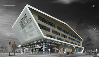
Design a building which is combined with digital media become more challenging for MCM Partnership. Not only architectural aspect, but acoustic and technology aspect should be implemented. A digital media building should give audio effect like a commercial theater. This complete features could be found in the Center for Digital Media of the Great Northern Way campus. This special building aimed for their Master program, Digital Media.


MCM Partnership has shared their design for the Great Northern Way’s new campus building, the Center for Digital Media. Follow after the jump for additional rendering, graphics and a description from the architect.
This new building will house the Masters of Digital Media (MDM) Program and provide student dormitory enrolled in the program. The design of this building is a vessel for emerging technology set within an industrial context of the Great Northern Way campus (GNWC). The concept diagrams describe the building as a technology ribbon around the program uses. Inspired by two themes or dialogues – technology and regionalism
A singular ribbon, folding and bending, collects these uses to engage the street as the catalyst marker on the Great Northern Way Campus site. The wrapping gesture is directional to reflect the orientation of the student housing and to minimize solar heat gain on the east and west elevations. The exterior wrap symbolizes industry and is expressed in the metal recalling the Finning International industrial site; the interior wrap symbolizes Regionalism and is expressed in the use of cedar wood.

Visit MCM Partnership website - here or via

Minggu, 16 Januari 2011

Salvador Dali Museum by HOK

Last week marked the grand opening for the Salvador Dali Museum in St. Petersburg, Florida. This new museum building replace the old one which only has half size and built in 1982. Utilizing free-form geodesic geometry, the triangulated glass organically flows around and attaches to the rigid unfinished concrete box, a play of hard and soft, protecting Dali’s paintings and simultaneously providing natural daylight and openness to the adjacent bay. This is the first use of this type of free-form geodesic geometry in the United States. Mesmerizing visitors within the museum is the coiled concrete form that greets them at the reception desk. The poured in place raw concrete spiral staircase is fitted with light cable-stayed stainless steel guardrails. The material choices provide a subtle juxtaposition along with an obvious nod to Dali’s allure with the double helix and other spiral forms in nature.

“We constantly consider the visitor experience when we design a museum. A large number of people visiting a museum will be there for the first time. The architecture must be extremely easy to understand. It can be quite adventurous and stimulating, but the circulation pathways should be clear from the moment visitors arrive at the building, “ shared Yann Wymouth design director for HOK Florida.

 
HOK’s design concept is drawn directly from the building’s purpose. It is inspired both by Dalí’s surrealist art and by the practical need to shelter the collection from the hurricanes that threaten Florida’s west coast.
“Salvador Dalí was a monumental pioneer of twentieth-century art and this is perhaps the best collection of his work in the world,” said Weymouth. “Our challenge was to discover how to resolve the technical requirements of the museum and site in a way that expresses the dynamism of the great art movement that he led. It is important that the building speak to the surreal without being trite.”


Souece : Archdaily