Sabtu, 29 Januari 2011

Getty Center by Richard Meier and Partner Architects

The Getty Center is placed on a narrow, hilly stretch high above the San Diego Freeway in Los Angeles California. Jutting southward from the Santa Monica Mountains, the museum’s acropolis-like stature has spectacular views over the city, the mountains and the ocean. This advantages come from it's location which is higher than the surrounding.

The Getty Center project was started on 1984 with the total cost reached $1 billion. Coined, “the commission of the century”, this museum got mandate to advance knowledge and nurture critical seeing through the growth and presentation of its collections and by advancing the understanding and preservation of the world’s artistic heritage. Today the Museum’s permanent collection contains Greek and Roman antiquities, 18th-century French furniture and European paintings, and is visited by more than 1.8 million people a year.

Completed in 1997, Richard Meier’s program brings the seven components of the Getty Trust into a coherent unity, while maintaining their individual identities. The layout establishes a dialogue between the angle of intersection and a number of curvilinear forms that are largely derived from the contours of the site inflected by the Freeway, the metropolitan grid and the natural topography; the overall parts relate to both the City of Los Angeles and the Santa Monica Mountains.
 
The Museum acts as the centerpiece and the main entrance to the Center. Stepping off the tram that takes you from the base of the mountain and parking area to the Welcome Center and into the Museum. The entrance lobby has a sun-lit circular foyer, and provides views through the courtyard to gallery structures arrayed in a continuous sequence. Throughout the Museum there is a layering in section between paintings, illuminated by skylights on the top floor and artworks which must be shielded from ultraviolet light on the lower levels.

Visit Richard Meier and Partner Architects website - here or via archdaily

Sabtu, 22 Januari 2011

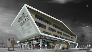
Center For Digital Media by MCM Patnership

Design a building which is combined with digital media become more challenging for MCM Partnership. Not only architectural aspect, but acoustic and technology aspect should be implemented. A digital media building should give audio effect like a commercial theater. This complete features could be found in the Center for Digital Media of the Great Northern Way campus. This special building aimed for their Master program, Digital Media.


MCM Partnership has shared their design for the Great Northern Way’s new campus building, the Center for Digital Media. Follow after the jump for additional rendering, graphics and a description from the architect.
This new building will house the Masters of Digital Media (MDM) Program and provide student dormitory enrolled in the program. The design of this building is a vessel for emerging technology set within an industrial context of the Great Northern Way campus (GNWC). The concept diagrams describe the building as a technology ribbon around the program uses. Inspired by two themes or dialogues – technology and regionalism
A singular ribbon, folding and bending, collects these uses to engage the street as the catalyst marker on the Great Northern Way Campus site. The wrapping gesture is directional to reflect the orientation of the student housing and to minimize solar heat gain on the east and west elevations. The exterior wrap symbolizes industry and is expressed in the metal recalling the Finning International industrial site; the interior wrap symbolizes Regionalism and is expressed in the use of cedar wood.

Visit MCM Partnership website - here or via

Minggu, 16 Januari 2011

Salvador Dali Museum by HOK

Last week marked the grand opening for the Salvador Dali Museum in St. Petersburg, Florida. This new museum building replace the old one which only has half size and built in 1982. Utilizing free-form geodesic geometry, the triangulated glass organically flows around and attaches to the rigid unfinished concrete box, a play of hard and soft, protecting Dali’s paintings and simultaneously providing natural daylight and openness to the adjacent bay. This is the first use of this type of free-form geodesic geometry in the United States. Mesmerizing visitors within the museum is the coiled concrete form that greets them at the reception desk. The poured in place raw concrete spiral staircase is fitted with light cable-stayed stainless steel guardrails. The material choices provide a subtle juxtaposition along with an obvious nod to Dali’s allure with the double helix and other spiral forms in nature.

“We constantly consider the visitor experience when we design a museum. A large number of people visiting a museum will be there for the first time. The architecture must be extremely easy to understand. It can be quite adventurous and stimulating, but the circulation pathways should be clear from the moment visitors arrive at the building, “ shared Yann Wymouth design director for HOK Florida.

 
HOK’s design concept is drawn directly from the building’s purpose. It is inspired both by Dalí’s surrealist art and by the practical need to shelter the collection from the hurricanes that threaten Florida’s west coast.
“Salvador Dalí was a monumental pioneer of twentieth-century art and this is perhaps the best collection of his work in the world,” said Weymouth. “Our challenge was to discover how to resolve the technical requirements of the museum and site in a way that expresses the dynamism of the great art movement that he led. It is important that the building speak to the surreal without being trite.”


Souece : Archdaily